Color is one of the fastest emotional signals in interior space. Before users evaluate layout or furniture quality, they react to tonal temperature, contrast level and chromatic intensity.
That makes color selection a strategic decision, not a finishing step. Warm palettes can boost social energy, while cooler hues often support calm focus and cognitive clarity.
Context matters. The same hue can feel balanced in one project and overwhelming in another depending on daylight, material reflectance and occupancy patterns.
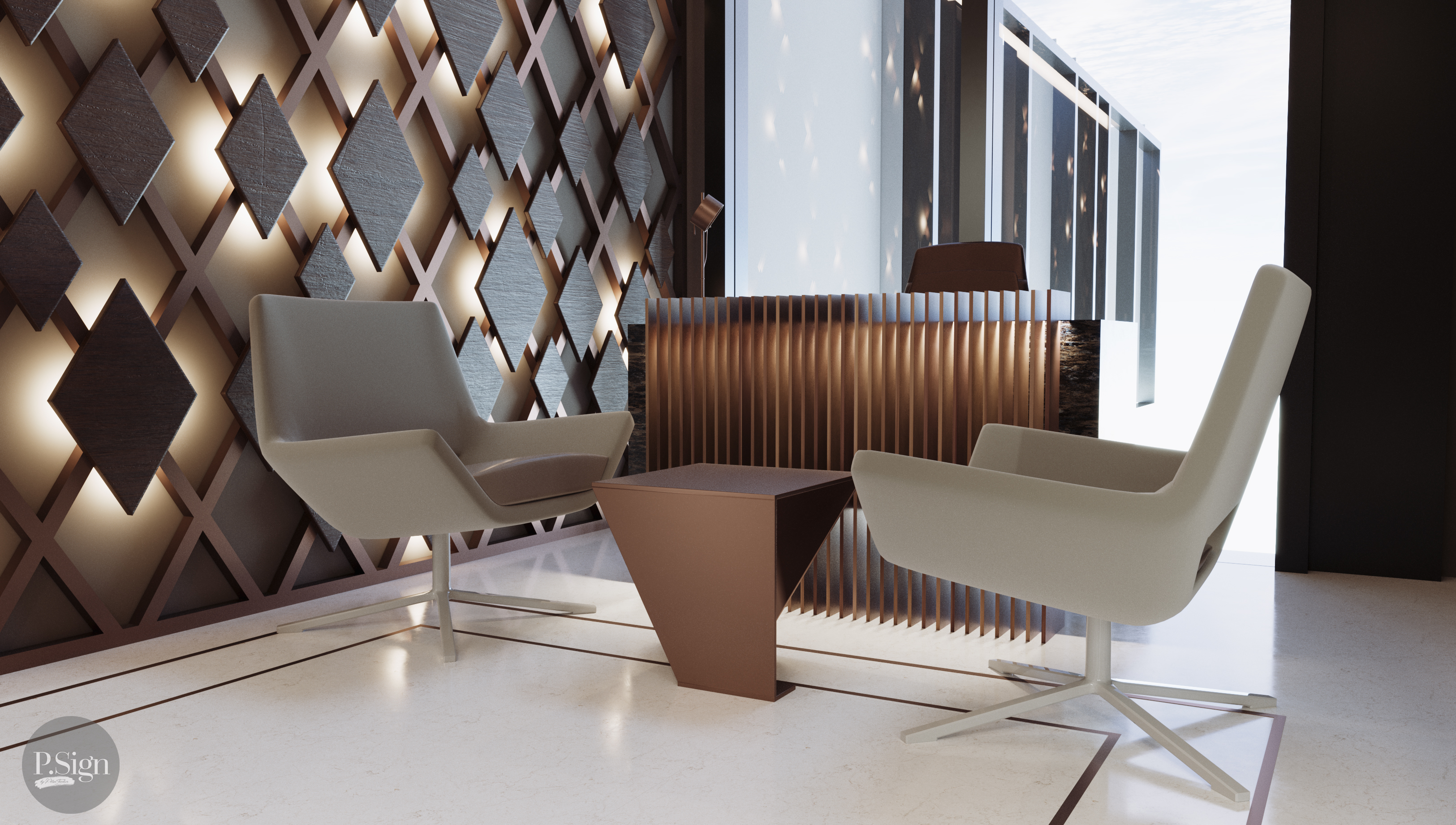
In workplaces, controlled contrast over neutral foundations usually supports long-duration comfort. Accent colors can then be used intentionally for wayfinding, hierarchy and brand identity.
In residential design, room-specific color logic is more effective than a single whole-home palette. Sleep zones, work corners and social areas benefit from different emotional targets.
P.Sign develops color strategies by combining user behavior, project identity and lighting conditions, creating interiors that are expressive, functional and psychologically coherent.